CSS: Create a Hero Block with Layered Images at Oblique Angle with Pure CSS
Jul 1, 2024 • Chris Pietschmann • CSS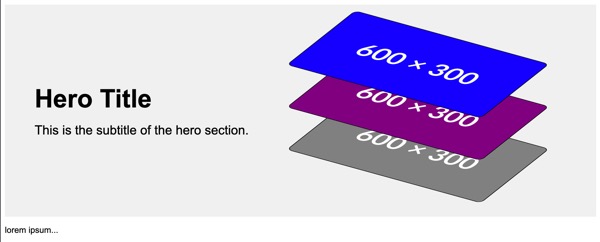
Hero blocks are a powerful visual component typically placed at the top of a landing page or homepage. It often includes a large image, title, and subtitle to capture the user’s attention immediately. Let’s look at creating a hero block with layered images, displayed at oblique angles, using pure CSS. The final result will be a visually appealing section where images are positioned vertically with 3D transformations, and zero javascript will be used.
HTML Structure
Let’s start with the basic HTML structure. Our hero block will contain a div for text (title and subtitle) and three images.
<!DOCTYPE html>
<html lang="en">
<head>
<meta charset="UTF-8">
<meta name="viewport" content="width=device-width, initial-scale=1.0">
<title>Hero Block</title>
<style>
    /* CSS goes here */
</style>
</head>
<body>

<div class="hero">
    <div class="hero-text">
        <h1 class="hero-title">Hero Title</h1>
        <p class="hero-subtitle">This is the subtitle of the hero section.</p>
    </div>
    <img src="https://placehold.co/600x300/grey/white" alt="Hero Image" class="hero-image">
    <img src="https://placehold.co/600x300/purple/white" alt="Hero Image" class="hero-image">
    <img src="https://placehold.co/600x300/blue/white" alt="Hero Image" class="hero-image">
</div>

<p>
lorem ipsum...
</p>

</body>
</html>
In this structure, the hero block (div.hero) contains two main parts: div.hero-text for textual content and three img.hero-image elements for the images.
CSS Styling
Now, let’s dive into the CSS that brings our hero block to life. The goal is to style the hero block, align the text, and position the images vertically with a 3D transformation effect.
Base Styles
First, we’ll set up some base styles for the body and hero block.
body {
    font-family: Arial, sans-serif;
}

.hero {
    position: relative;
    display: flex;
    justify-content: space-between;
    align-items: center;
    padding: 3.5em;
    background-color: #f0f0f0;
    height: 18em;
}
Here, we’ve applied a sans-serif font to the body. The .hero class uses flexbox to align its content horizontally, with padding and a background color. The height is set to ensure enough space for the content.
Text Styling
Next, let’s style the text within the hero block.
.hero-text {
    max-width: 50%;
}

.hero-title {
    font-size: 3rem;
    margin: 0;
}

.hero-subtitle {
    font-size: 1.5em;
    margin: 0.75em 0 0 0;
}
The .hero-text class restricts the text container to 50% of the hero block’s width. The .hero-title and .hero-subtitle classes style the title and subtitle respectively, setting appropriate font sizes and margins.
Image Styling and Positioning
Finally, we’ll style and position the images. This part involves applying 3D transformations and layering the images vertically.
.hero-image {
    position: absolute;
    max-width: 40%;
    transform: rotateX(60deg) rotateY(-5deg) rotateZ(35deg);
    border: solid 0.1em #000;
    border-radius: 0.75em;
    right: 10%;
}

.hero-image:nth-child(2) {
    top: 8em;
}

.hero-image:nth-child(3) {
    top: 3em;
}

.hero-image:nth-child(4) {
    top: -2em;
}
The .hero-image class applies absolute positioning to the images, ensuring they are positioned relative to the .hero container. The transform property rotates the images around the x, y, and z axes, creating a dynamic 3D effect. Each image has a border and rounded corners for a polished look.
The nth-child pseudo-class is used to layer the images vertically by setting different top values. This positioning ensures the images overlap slightly but remain distinguishable.
Full Code Example
Here’s the full code put together:
<!DOCTYPE html>
<html lang="en">
<head>
<meta charset="UTF-8">
<meta name="viewport" content="width=device-width, initial-scale=1.0">
<title>Hero Block</title>
<style>
    body {
        font-family: Arial, sans-serif;
    }

    .hero {
        position: relative;
        display: flex;
        justify-content: space-between;
        align-items: center;
        padding: 3.5em;
        background-color: #f0f0f0;
        height: 18em;
    }

    .hero-text {
        max-width: 50%;
    }

    .hero-title {
        font-size: 3rem;
        margin: 0;
    }

    .hero-subtitle {
        font-size: 1.5em;
        margin: 0.75em 0 0 0;
    }

    .hero-image {
        position:absolute;
        max-width: 40%;
        transform: rotateX(60deg) rotateY(-5deg) rotateZ(35deg);
        border: solid 0.1em #000;
        border-radius: 0.75em;
        right: 10%;
    }

    .hero-image:nth-child(2) {
        top: 10em;
    }

    .hero-image:nth-child(3) {
        top: 5em;
    }

    .hero-image:nth-child(4) {
        top: 0;
    }
</style>
</head>
<body>

<div class="hero">
    <div class="hero-text">
        <h1 class="hero-title">Hero Title</h1>
        <p class="hero-subtitle">This is the subtitle of the hero section.</p>
    </div>
    <img src="https://placehold.co/600x300/grey/white" alt="Hero Image" class="hero-image">
    <img src="https://placehold.co/600x300/purple/white" alt="Hero Image" class="hero-image">
    <img src="https://placehold.co/600x300/blue/white" alt="Hero Image" class="hero-image">
</div>

<p>
lorem ipsum...
</p>

</body>
</html>
Conclusion
By combining HTML and CSS, we’ve created a visually appealing hero block with layered images and 3D transformations. This design technique can make your webpage stand out, capturing users’ attention right from the start. Feel free to adjust the styles and positioning to match your design preferences and create a unique hero block for your website.
This example demonstrates the power and flexibility of CSS in web design, allowing you to create complex and engaging visual elements with just a few lines of code.
Happy CSS styling!
Chris Pietschmann
DevOps & AI Architect | Microsoft MVP | HashiCorp Ambassador | MCT | Developer | Author
I am a DevOps & AI Architect, developer, trainer and author. I have nearly 25 years of experience in the Software Development industry that includes working as a Consultant and Trainer in a wide array of different industries.


Recent Posts
-
Microsoft AI Skills Fest Badge Rendered as Pure HTML/CSS
09 Apr 2025 -
C#: What's the Difference Between `int`, `var`, and `dynamic`?
09 Apr 2025 -
Leveling Up with Microsoft AI Skills Fest for Guinness World Record Attempt
08 Apr 2025 -
Chris Pietschmann recognized as a HashiCorp Ambassador for 2025
31 Mar 2025 -
Adapt as an AI Developer of Be Left Behind
20 Mar 2025
Recent on Build5Nines.com


